
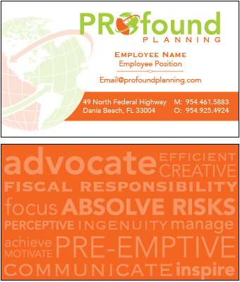

Below is a corporate identity treatment that I designed for PROfound Planning. PROfound is a branch of the existing company Cream of the Crop Events, and needed its own identifiable logo and related assets. The pieces highlighted here are include in order: The stacked and horizontal variants of the logo in all colors, the template for the company’s business cards (front and back), and several of my initial mockup slides for the company’s website design.
The color choices reference the branding of Cream of the Crop Events in order to create a unity between the two groups. However the visual treatment, typography choices, and and icon design were all built fresh from the ground up. The bright colors, flat textures, and font choices were all chosen to increase legibility, and to present a bold and friendly tone. The length of the name of the company necessitated two variants, one stacked and one horizontal, in order to accommodate all possible uses.
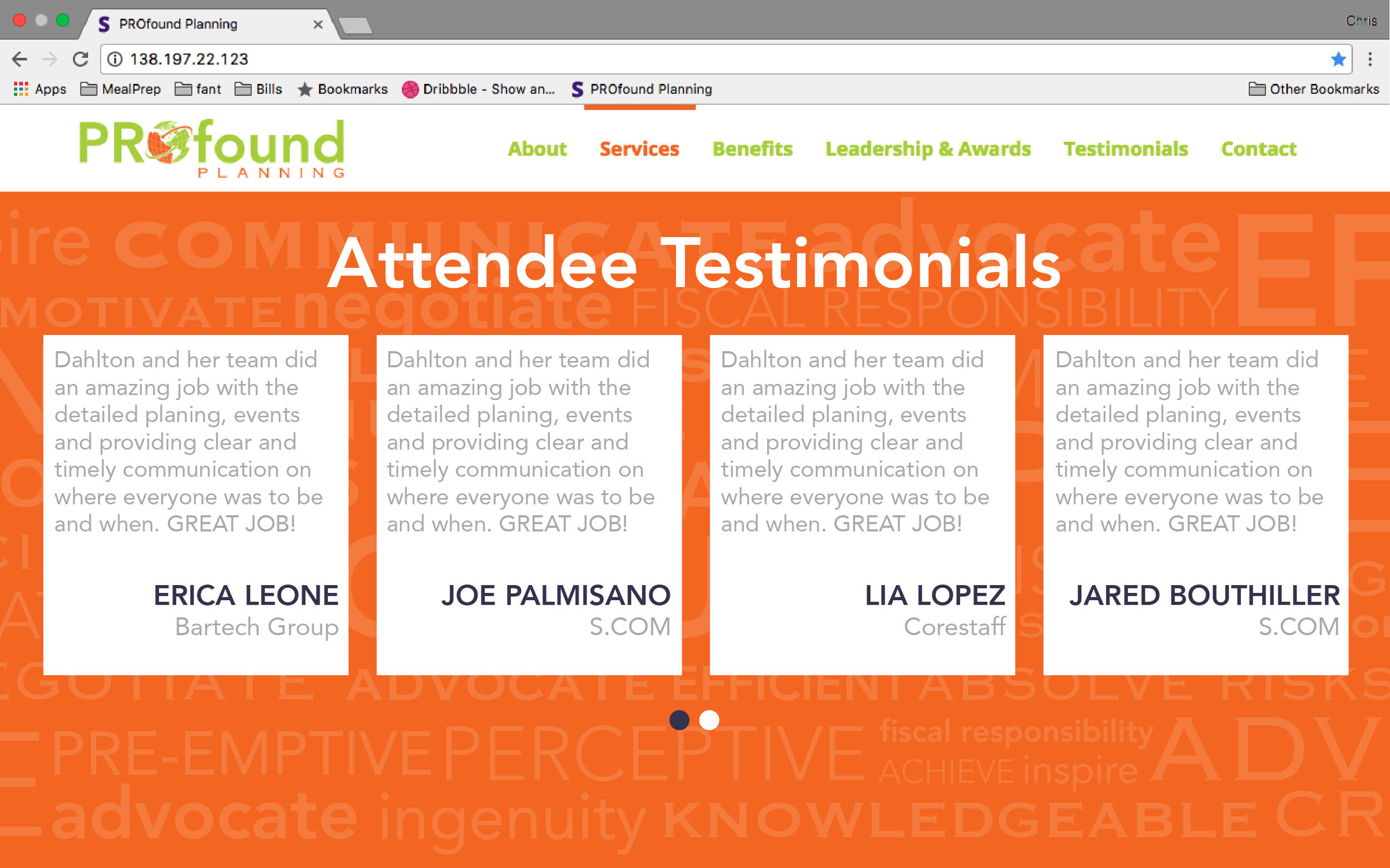
In addition to the globe, PROfound planning makes use of a word cloud as a recurring graphic element. This features predominantly on their business cards and on their website. In order to keep the word cloud from becoming too distracting or overbearing to the design, it is always presented as a light tint, allowing it to behave more as a texture than as high priority information.
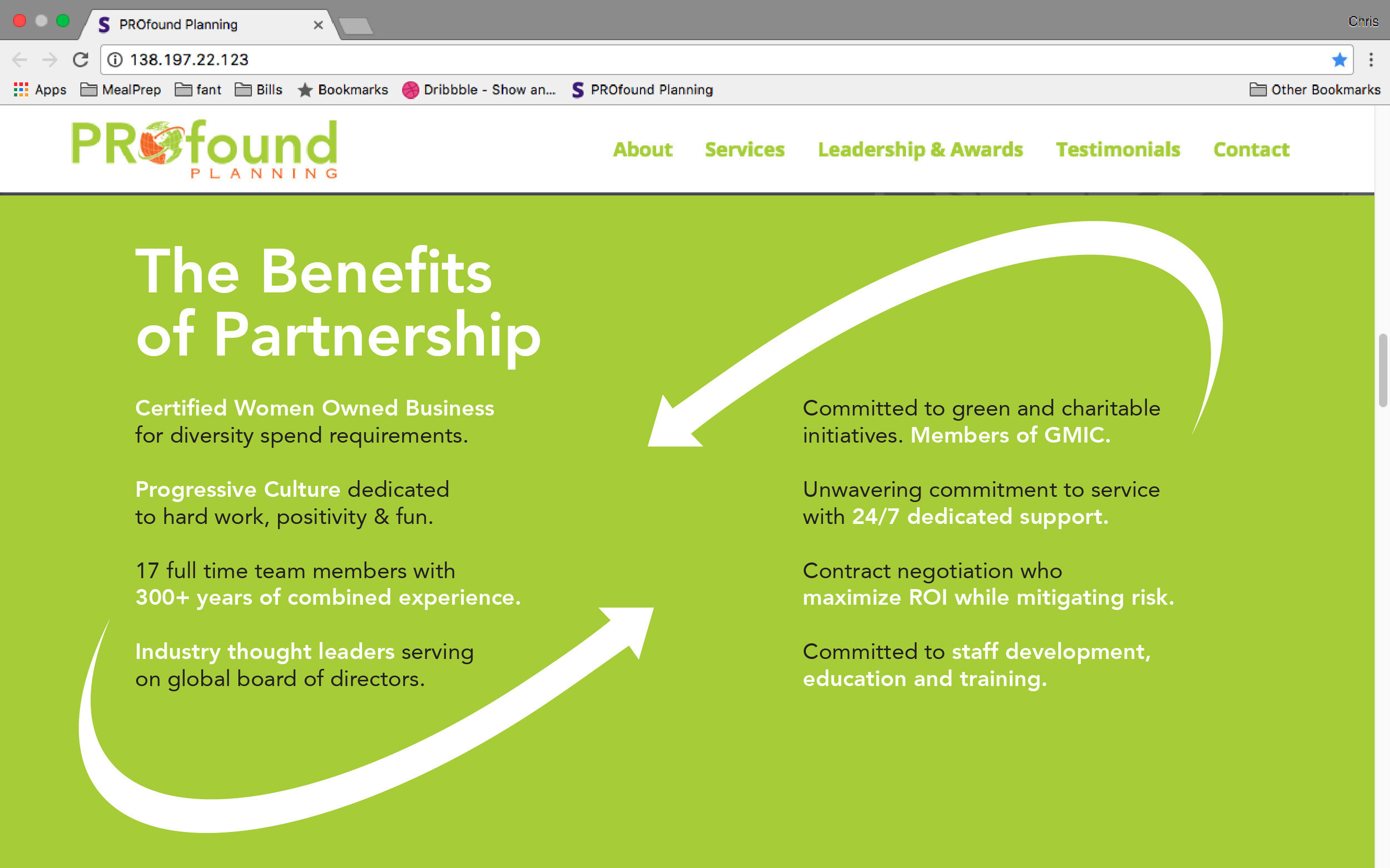
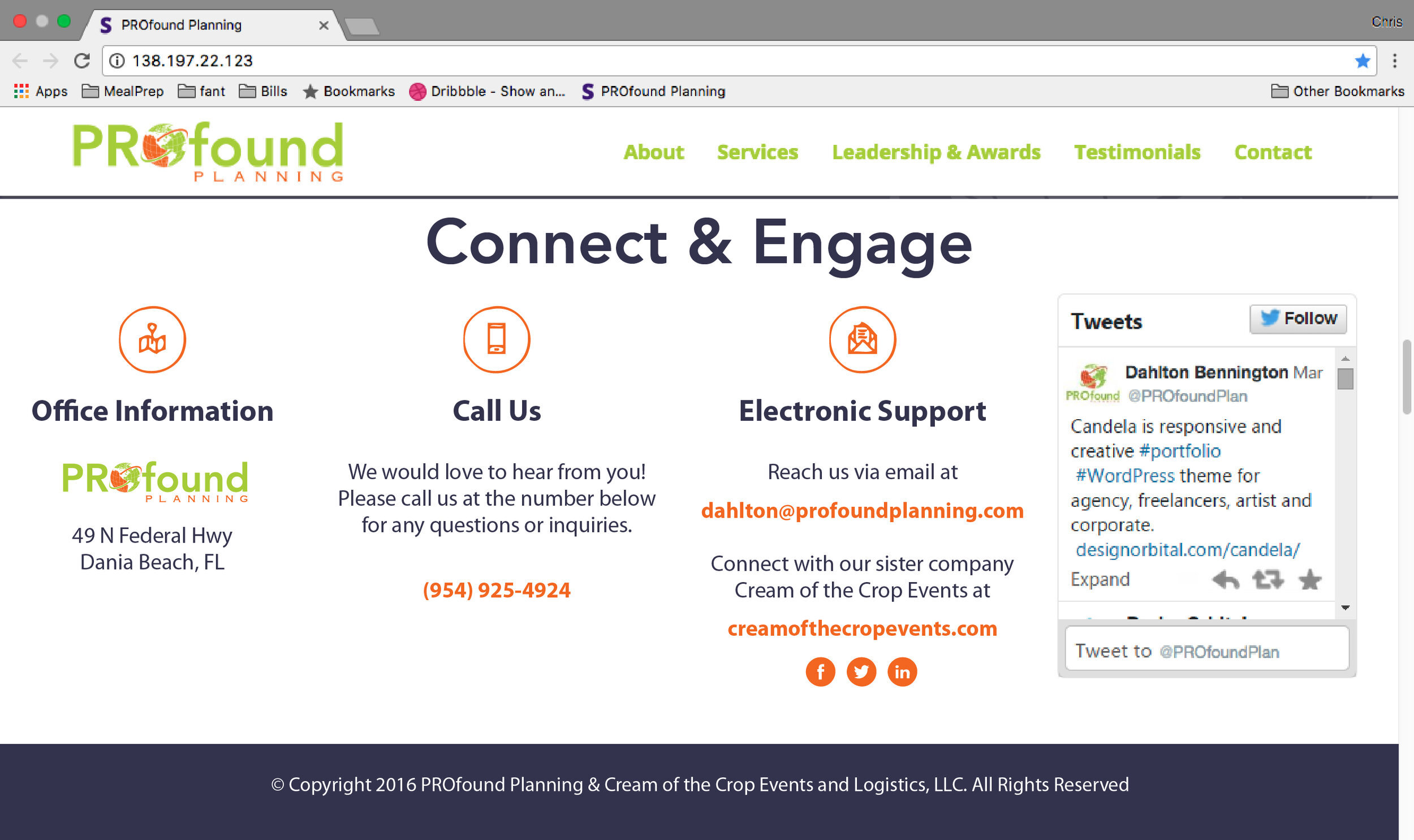
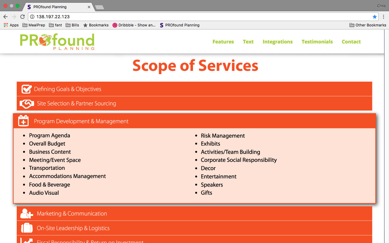
The website was designed in collaboration with PROfound’s in-house web developer. He and I worked closely to accommodate each other’s vision for the finished piece. The website is still in use today, and can be seen at www.profoundplanning.com